Proving the business idea
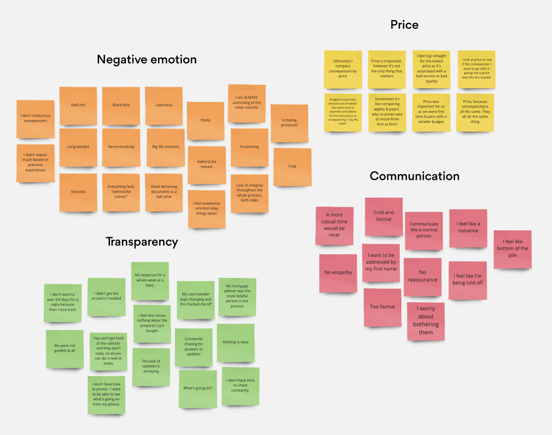
Before designing solutions, we needed to understand our audiences. To frame the user interviews, I led customer segmentation research and facilitated a workshop with stakeholders and product owners. Together, we explored behaviours, locations, attitudes and demographics across key segments.
From these sessions, strong themes began to emerge. These insights informed the structure of our interviews and ensured that questions were relevant to each group. For instance, we anticipated that first-time buyers would approach conveyancing very differently from those with prior experience, so we designed the research to capture both perspectives in detail.