Understanding Gen Z
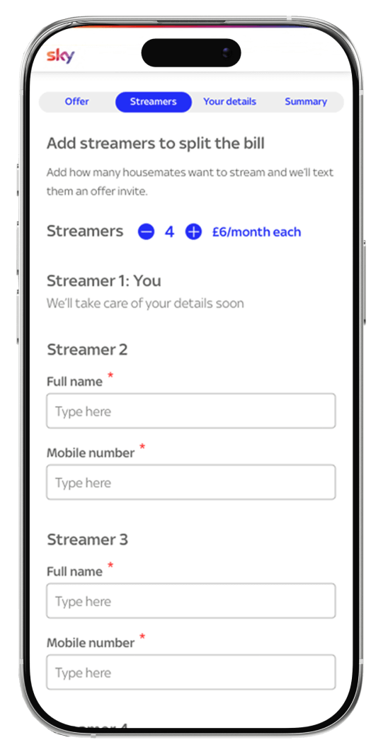
Sky needed to win over Gen Z, but this was no easy task. Checkout was complicated, pricing felt steep, and the brand’s positioning simply was not landing. To dig deeper, we partnered with universities and ran interviews with 15 students, uncovering their motivations, housemate dynamics, media habits, and UX expectations. These insights formed the foundation of our design decisions.
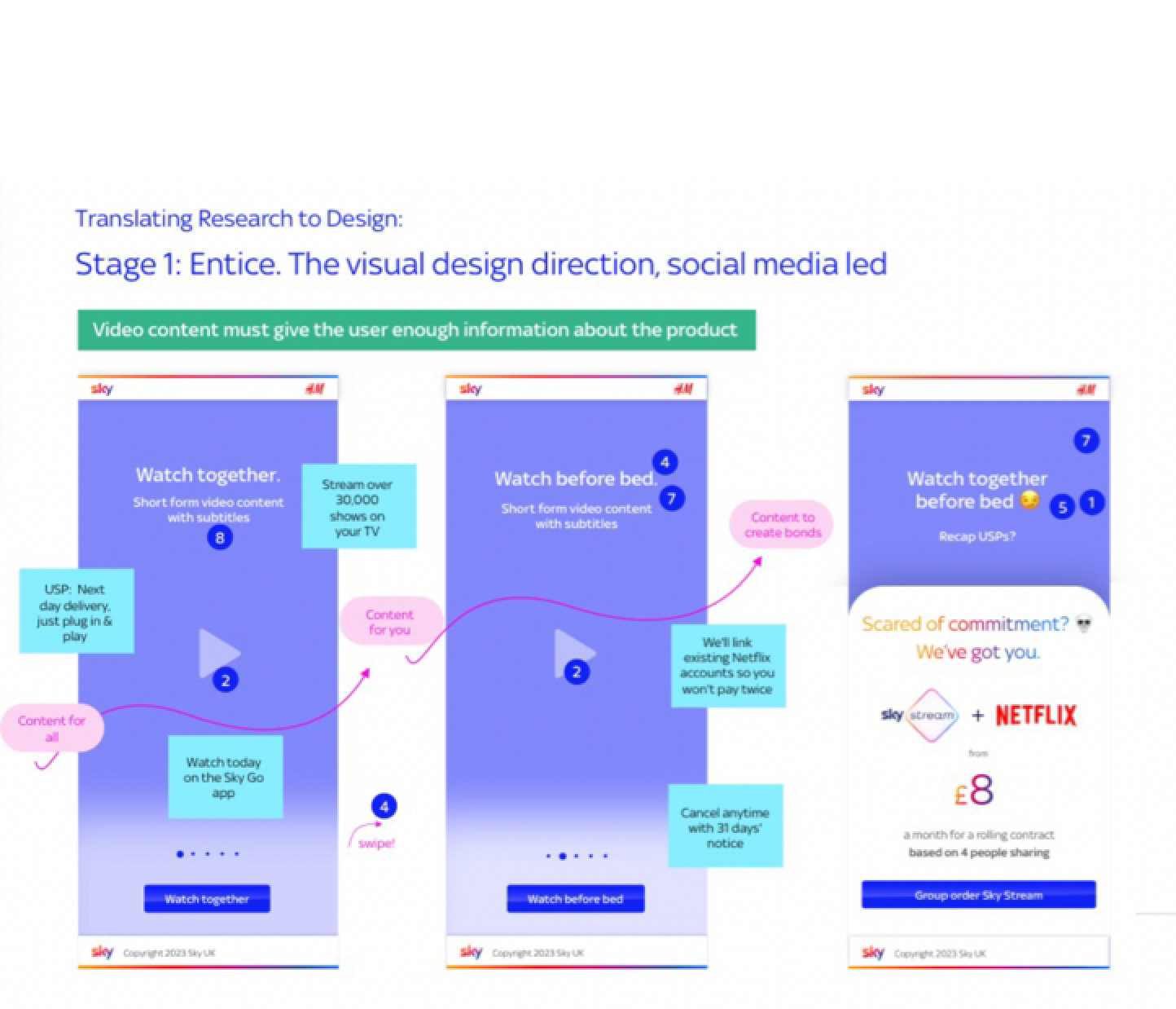
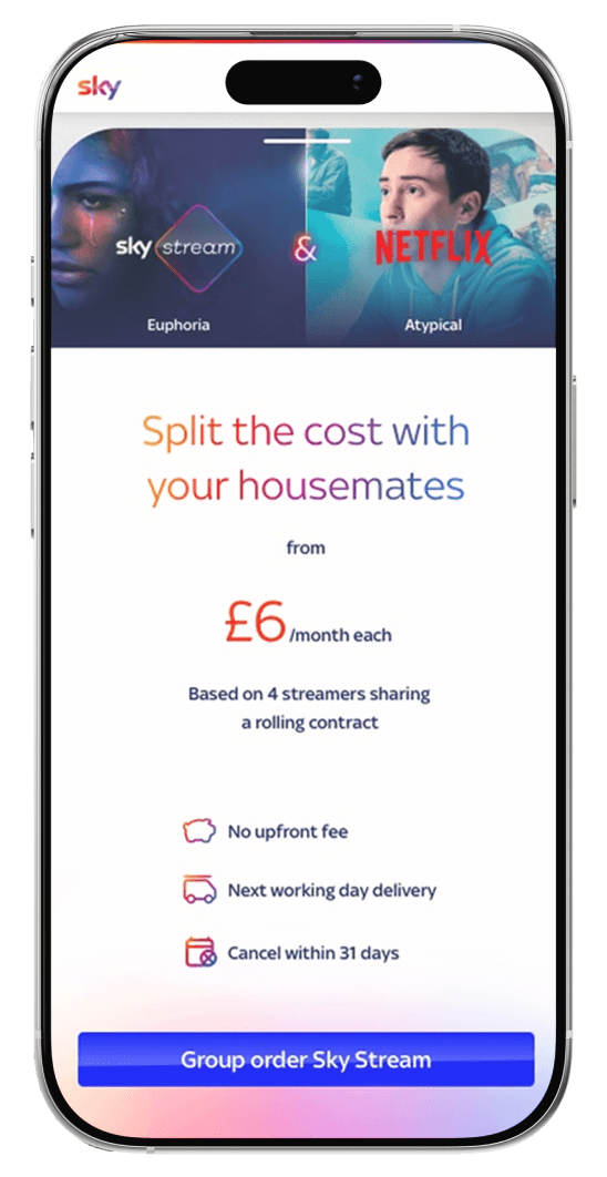
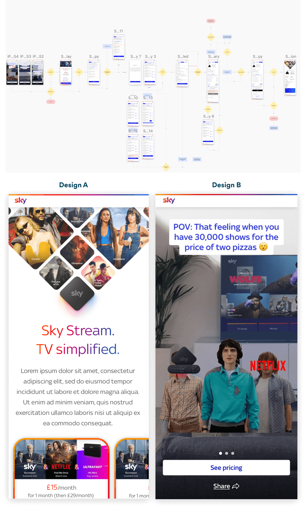
Affordability was the first barrier, but it was not the whole story. Students wanted more than just a low price, they craved authenticity. That meant real imagery and video content, paired with tongue in cheek messaging that reflected their culture. With an attention span averaging just eight seconds, capturing and keeping interest became the design challenge.
To guide our approach, we translated our research into clear problem statements, hypotheses, and design principles that shaped ideation and kept us focused on what mattered most.

.png)